David Spero

David Spero was born in 1963 and studied photography at the Royal college of Art, London. His work was also presented in the British Council.

In 2001 Spero started an ongoing series called “Ball Photographs” – this meant he was photographing coloured balled in existing and temporary locations.

Screen Shot 2015-03-15 at 12.28.45

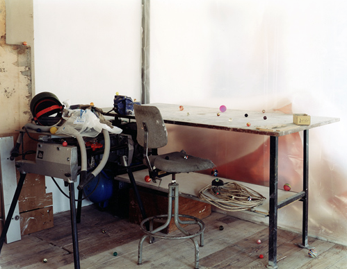
In this image he has taken, shows different sized coloured balls scattered around a table, chair, floor and other objects as well. These objects look quite old in this image, however the coloured balls seem to light up this image and make the dull colours be highlighted. When I look at Spero’s work with coloured balls placed around everywhere makes me analyse and take more time over looking at this image. This is because the coloured balls almost represent the different parts in the image and this forces us to analyse each point individually.

Screen Shot 2015-03-15 at 12.47.52

This second photograph taken by Spero involves balls which are a lot larger and more dominant in the image. They are placed on the sofa, piano and wooden frames. Not all of them are larger balls but they’re also very small ones as well. This makes the image very detailed and makes the audience want to analyse every part of the image. The larger coloured balls in this image makes me more drawn to it and pick up more detail.

http://www.davidspero.co.uk/biography.html

http://arts.brighton.ac.uk/

(Accessed 12th March 2015)

John Stezaker In-depth artist research

Carrying on from my previous research on Stekazer, I am now going to compare and contrast two of his images.

Screen Shot 2015-05-11 at 14.31.38 Screen Shot 2015-05-11 at 14.31.55

These two images make quite a large focus on the eyes and where they are looking. The first image technically contains three sets of the same eye which has produced this effect here. It looks like images have been cut out and stuck onto the original image. The second image involves a woman and the lower part of her face and a man stuck on top of this image above her. The two different sex’s placed so closely together create a very quirky piece of work and is extremely unusually. I would also say unusual is also the word to be used for the first image as well because when I focus on it for a long time, the lines almost look like they’re moving.

I like how in the second image, the image on top of one another is roughly stuck on top. This gives a strong homemade effect and I personally feel it looks more artistic. Due to the backgrounds in both images, I have no idea what environment these people are in or what they are doing. This is what makes these images mysterious and questionable.

Final Piece

image1-5

I chose this collage I created as my final piece to submit because the images I have ripped out of VOGUE magazine add such a powerful emphasises on my own work in the centre. The large sunglasses against the small ones are really contrasting and work in a very creative way. My aim was to create a homemade effect which I feel I have achieved here because of the way I have torn the pieces of paper out on the magazine and the way I have arranged it all together. This piece of work very much links to hand and eye.

Alexander Rodchenko In-depth artist research

Rodechenko is a Russian artist who was born in 1891 and died in 1956.

He first started out as a painter, sculptor and graphic design and then in the 1920s he developed an interest in photography. Close-ups of interesting details and sharp camera angles. The subjects which he liked to engage to the strongest is the Soviet Union, documenting the social and political life linked to this.

Rodchenko was known to create photomontages including images such as Moscow’s streets and includes close portraits of Vladimir Mayakovsky.

He didn’t just intend to produce the typical art pieces, he tended to produce pieces of work which had the similarities of posters, book designs and magazines. This was due to the fact that he wanted to make a strong impact on such a large scale audience.

His work was classed as, “daring” – this word is quite a good description to his work because his work is so different to other artists and is very unique which makes it very edgy.

The Hayward mounted a show of Rodchenko’s work and coveys and strong message of the links between art and society.

Screen Shot 2015-05-11 at 12.57.35 Screen Shot 2015-05-11 at 12.58.09

This first image is strongly trying to reach out a message and is designed in a poster style way. It is bold and enthusiastic the way it has been illustrated and the image of this woman which is on the left. I like how a form of collage has been created her. The image on the right is very simple, doesn’t look staged and conveys a very homemade message which is another element which links to my project. This is because if you look closely you can see how this image is quite grainy. Just the way this woman is dressed also gives me a sense that these are her own clothes and also conveys a sense of an everyday theme due to the location and people involved and what they’re wearing.

When I focus on the second image, I receive a sense of emphasis on this woman’s outfit in the foreground and it leaves me thinking about what facial expression she is currently pulling as she has her back to the camera lens.

The first image is very precise and shows evidence of what I mentioned earlier, that Rodchenko focus’s on sharp camera angles and here he has formed this in a more artist way rather than capturing it through a camera lens.

Lavrentiev, Alexander (2008). Alexander Rodchenko: Revolution in photography. Russia : Multimedia Complex of Actual Arts. P6

Martin Schoeller In-depth artist research

Schoeller was born in 1968 in Munich, Germany. He studied at Lette-Verein in Berlin where he studied photography.

Schoeller currently works in New York and contributes to the magazine, ‘The New Yorker’. There are oversized portraits of lady body builders who have incredibly large eyes in his studio. Karl Julius Weber once said: “The face is a record of character”.

A light bouncing off the damp surface of the eyes is noticeable as are the outlines of a shadow. The light enables the photographer to see and the outlines are of the photographer himself. The identification of a photographer is always shown in their work, like Schoeller’s.

Schoeller has taken photographs of Bill Clinton, Angelina Jolie and at the end of his photographic sessions he habitually asked, “Could you look this way for a sec?” and in this way he obtained headshot of his subjects, which were published in his book called ‘Close-up’.

Schoeller got a lot of relevant experience from being Annie Leibovitz’s assistant. However, when Schoeller went freelance he had a complete change of direction instead of photographing celebrities he spent three months at night time in a New Jersey police station which is a massive contrast.

Schoeller said that the majority of his work involved exact and thorough preparation. He says, “the lighting, location and everything else have to exactly fit the people and their story. Then they can be handled”.

1_Clooney_George_44_F_header1-2 schoeller_full

Both of these images capture two people whose eyes look very glazed over and look reasonably happy. The first image very strongly interests me because this man’s eyes are hidden with a paper cut out of another man’s eyes or they could be his own eyes in this image which has been used. The collaging effect has been used which links to my own project because this is what I would like to do, collaging for my final piece. The skin tone and colour of this man’s eyebrows are the same tones to what is there originally in the image, which makes me presume that this is the same person and this collage effect is just used to create an interesting style.

The second image here is a very zoomed in image of this woman and shows a very clear and detailed portrait of her. We have no idea what sort of environment she is in but this image simply just emphasises on the bold features on this woman and the detail which Schoeller is so passionate about like I have previously mentioned in the eyes. The eyes in this image strongly glow and highlight her face.

This is also the same case with the first image. This man’s eyes are extremely bright in a discrete way even though this is shown on a piece of paper.

Schoeller, Martin, (2003), Martin Schoeller, Fotographie, P3-10. (Accessed: 2015)

Viviane Sassen In-depth artist research

Sassen is based in Amsterdam where she was born. Sassen studied fashion design and then photography at Hogeschool. She is a fashion photographer.

Sassen is a very intuitive, spontaneous photographer. This is because Anna de Rijk says, “It’s as is everything comes to her immediately. For her composition is a very instinctive thing, and she is confident about her instincts, she works pretty fast”. Sassen does not give her model’s any pre-planned ideas because this isn’t her style. Guillaume Henry said, “when model’s work with Viviane they abandon themselves”.

Sassen worked for magazines like ‘Purple’ and ‘Dazed and Confused’ alongside Emmeline de Mooji. They worked very well together with great spontaneity.

Sassen took a photograph of Anna de Rijk lying in a vineyard and only wearing a red clove. Sassen said, “I feel like I’m being myself in her photos”. Sassen makes the best of sunlight and mirrors in her photos. She worked very successfully with Roxane Danset, 35 portraits of Danset were taken in one day. Neither of them really cared about clothes and hairstyles, Danset said, ‘I would rather create a ‘creature’ with someone than create a fashion look, so Viviane was perfect for me”.

Sassen also had a very successful working relationship with the stylist Vanessa Reid who said, “There is an incredible energy between us, when we literally work instinctively, automatically”.

umbra-by-viviane-sassen-137101 Viviane_Sassen1

This urban style portrait on the left and the other portrait on the right give out many similarities in that these people’s face are not particularly visible due to the lack of light. It is also seen that both of these people are refusing to even make their faces very visible. This is because in the first image, the woman is covering the sides of her face with her hands and there is a dark blue shadow on her face which hides it even more. This woman looks as if she is in a built up area, whereas the boy in the second image is surrounded by a natural environment. It is interesting that this boy’s face is very dark and not very visible because he is standing in direct sunlight, however he is dark skinned and is holding his hand up in front of his eyes and forehead which creates even more darkness.

When I focus on both of these images, I receive a sense of curiosity and that there must be story behind these hidden faces. The fact that this boy’s hand which is held up is painted gold, reflects strongly on against the sun and highlight the image instantly when analysing it.

These two images link to my work because this is the composition I want to use and create. I wanted to also thoroughly analyse and compare the natural environment and the manmade environment.

Sassen, Viviane . (). Biography . Available: http://www.stevenson.info/artists/sassen.html Last accessed 10th May.(Accessed 2015)

Berg den van, Nanda and Cotton, Charlotte (2013). Viviane Sassen – In and Out of Fashion. London : Prestel Publishing Ltd. No page numbers.(Accessed 2015).

Mario Testino In-depth artist research

Testino was born in 1954 in Peru. He studied at, University of the Pacific, San Diego and Pontifical Catholic University of Peru.

Testino is a superb photographer, art collector and entrepreneur. He is famous for his concentration on beauty and smart fashion. He is very personable – Nicole Kidman said, ‘He gives you the feeling of being unique’. I get a sense that timing is clearly very crucial in Testino’s work. Its amazing that every time he embarks on a new assignment, he regards it as a precarious task. This reflects on the fact that Testino’s personality is very humble.

Fashion creators and stars have a very high regard for Testino because he always takes flattering images of them. He would never release any poor quality images.

Testino is the most influential photographer in world and has progressed over the years, he said, “Beauty bores me… What I used to describe as beautiful, I now find terribly superficial. I look more deeply and demandingly now” – Mario Testino, Stern Fotographie. His latest photographs show his desire to travel into the depths of his subject. For example, he photographed the upper part of a coke bottle and his model’s are photographed without smart tans.

Testing went to London in 1979 and was greatly influenced by David Bailey, Helmut Newton and Cecil Beaton.

PHOT-MarTestino-500-V-1 Vogue-Brasil-May-2011-by-Mario-Testino-DesignSceneNet-03

These two images share many similar qualities and features. They both involve elegance, glamour and sophistication. The way their heads are angled in the side creates all these elements. They both contain faces of relaxation and look content. There is a strong contrast in the clothes they are wearing, the first model is wearing a dark classy looking coat and the second model is wearing a dark bikini top. These two items of clothing are very different, yet elegant.

The first image is very zoomed in and a lot is cropped out. Very little is shown in this image as it is so cropped. All that is involved is the model and her shadow on the left hand side. The background is simply a blank wall.

The second image however, is very central and cropped in an appropriate manner so that the composition and visibility of the top half of the model is very strong. The model’s eyes which have been made up with eye shadow and eyeliner powerfully result in a sense of mystery and curiosity – the fact that the model’s eyes are not visible at all.

Compared to the first image, I can see that this model is gazing into something and possibly deeply thinking about something.

Whatever and whoever is involved in Testino’s frame when he is taking an image, he clarifies to the audience that the way the subject looks is precisely what he wanted the minute he closed the shutter.

Testino, Mario (2006). Mario Testino . Germany : Fotographie . P2-10. (Accessed: 2015).

Kinmonth, Patrick (2002). Mario Testino Portraits . National Portrait Gallery, London : National Portrait Gallery. No page numbers.(Accessed: 2015)

Testino, Mario . (). Biography . Available: http://www.mariotestino.com/biography/. Last accessed 10th May

Bibliography

Journals

Asthoff, Jens. (2010). Pernille Koldbech Fich; KUNSTLERHAUS BETHANIEN. Artforum International Magazine, Inc.. 7 (49.1), P343.

Cannon, C.B.. (2012). Vogue Archive . CHOICE: Current Reviews for Academic Libraries. 7 (49.8), P1416.

Douglis, Phil. (2011). Defining character and personality with expressive portraiture. Photographic Society of America, Inc.. 7 (77.3), P30.

Geizler, Moshe . (2014). Portraits in colour . PSA Journal . 7 (80.11), P22.

Geizler, Moshe. (2007). Portraits in broad daylight. Photographic Society of America, Inc.. 7 (73.8), P22.

Hughes, John Andrew. (2014). 30-second portrait . Photographic Society of America, Inc.. 7 (80.2), P16.

Kropscot, Carole. (2009). Camera angle for portraits. Photographic Society of America, Inc.. 7 (75.4), P5.

Martin, John . (2014). That’s my take…on shooting strange . Photographic Society of America, Inc.. 7 (80.11), P15

Melendez, Franklin. (2011). Katy Grannan. Artforum International Magazine, Inc. 7 (49.8), P223.

Mikota, M.^Pavlovic, I.. (2010). ISO speed as the technical and creative element of the digital portrait photographs. International Vienna. 7 (1), P91.

Books

Berg den van, Nanda and Cotton, Charlotte (2013). Viviane Sassen – In and Out of Fashion. London : Prestel Publishing Ltd. No page numbers.(Accessed 2015)

Clarke, Graham (1992). The Portrait In Photography. London : Reaction Books . P115.(Accessed: 2015)(Accessed: 2015)

Kinmonth, Patrick (2002). Mario Testino Portraits . National Portrait Gallery, London : National Portrait Gallery. No page numbers.(Accessed: 2015)

Lavrentiev, Alexander (2008). Alexander Rodchenko: Revolution in photography. Russia : Multimedia Complex of Actual Arts. P6(Accessed: 2015)

MacSweeney, Eve (2012). VOGUE The Editor’s Eye. New York : Abrams. P8.(Accessed: 2015)

Schoeller, Martin, (2003), Martin Schoeller, Fotographie, P3-10. (Accessed: 2015)

Tarrant, John (2001). The Practical Guide to Photographic Lighting . Oxford : A division of Reed Educational and Professional Publishing Ltd. P3-13.(Accessed: 2015)

Testino, Mario (2006). Mario Testino . Germany : Fotographie . P2-10. (Accessed: 2015).

Websites

Sassen, Viviane . (). Biography . Available: http://www.stevenson.info/artists/sassen.html Last accessed 10th May.

Testino, Mario . (). Biography . Available: http://www.mariotestino.com/biography/. Last accessed 10th May

Collage 2

Screen Shot 2015-05-09 at 14.30.45

This is my second collage I made using VOGUE magazine. I wanted to still keep a strong emphasis on the images like the previous, so I still wanted to keep this collage simple. However, I thought ripping out pieces of articles and writing from VOGUE magazine would be a good idea, to create a vintage style collage. The muted colours within the writing contrasts really strongly with the images in the centre because they are so bright and the writing isn’t.

I think this idea works well and would be a strong final piece to submit.

Collage 1

image2

This is the first collage which I chose to create. I simply used a piece of pink card and stuck my favourite images  I had chosen in a contact sheet style. I decided to repeat my favourite images I had chosen.

This collage is extremely simple, however the pink card/background picks out the pink in the model’s scarf. All the colours actually match and coordinate great together. This simple background keeps a strong emphasis on just the images in the middle which works well because this is what this is all about. It is sharp, bold and clear.

I also like how the images aren’t stuck on perfectly – this is due to my homemade effect and I think that this is evident here.

I may consider this to be my final print to submit.